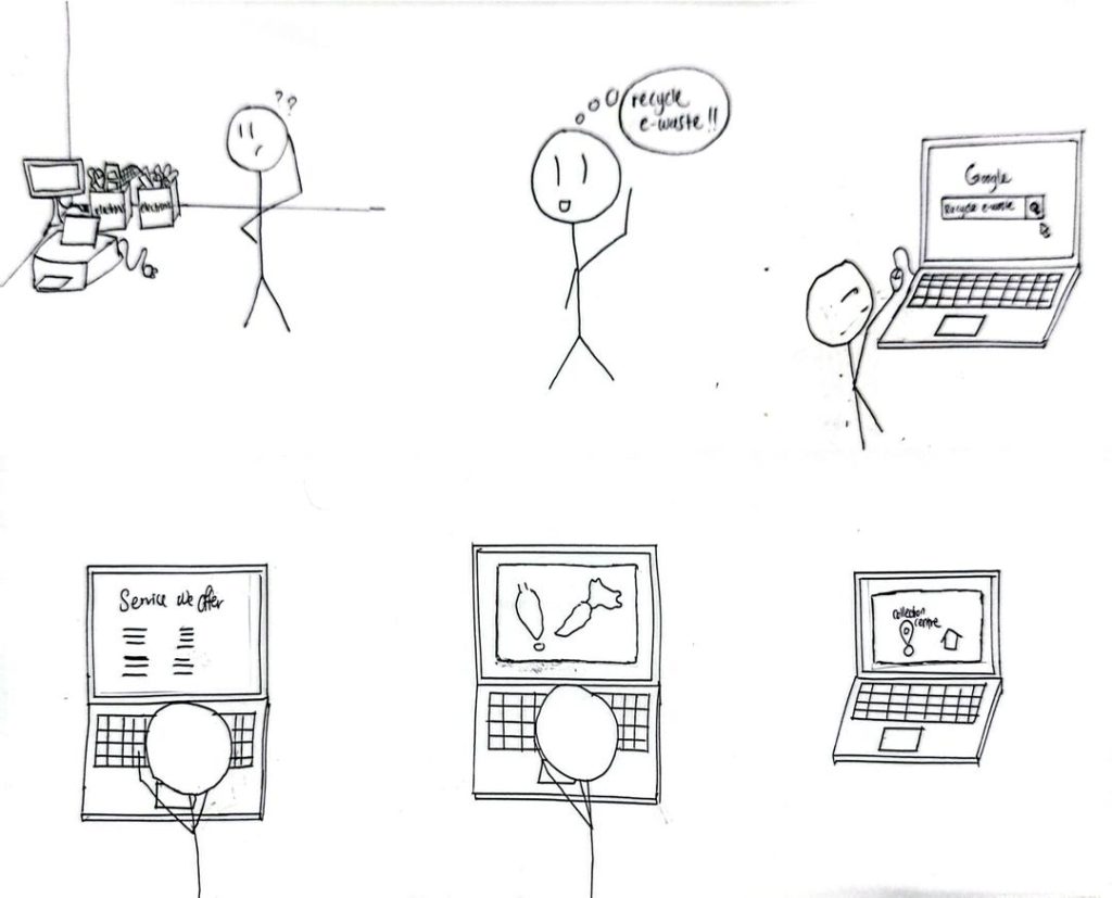
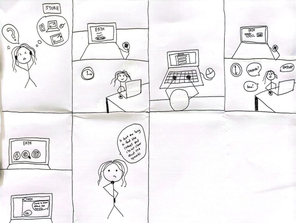
Storyboard
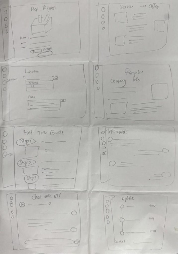
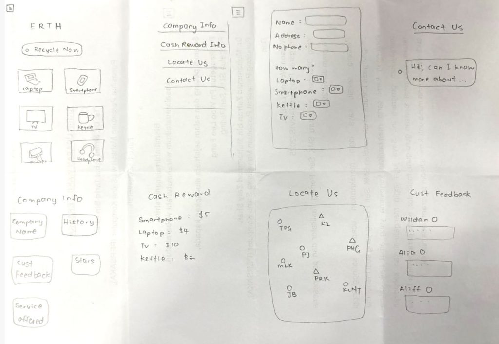
Task 1: Find the nearest certified e-waste drop off centers.
Task 2: Schedule home pickups for large or multiple e-waste items.
Task 3: Redeem points for discounts on tech repairs, e-vouchers, or donations to environmental NGOs.
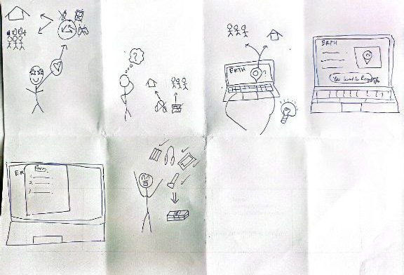
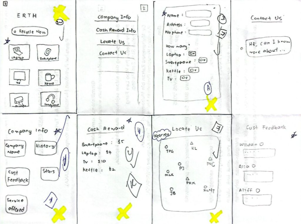
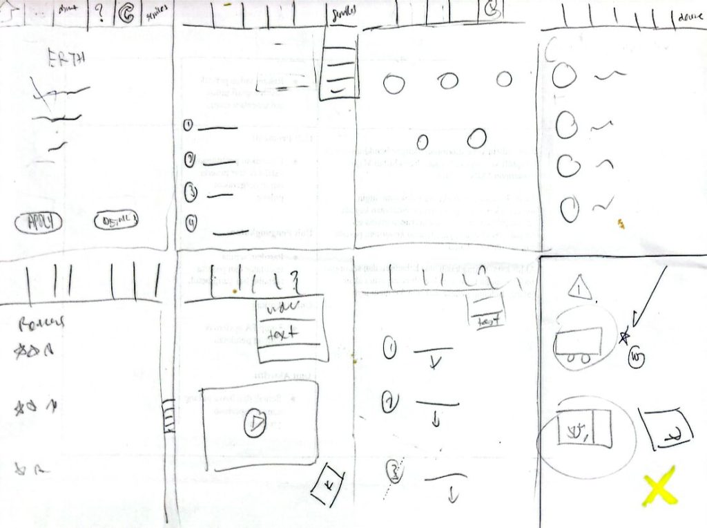
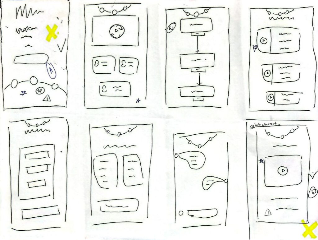
Crazy 8 Design
Alternative Design 1 – Wildan
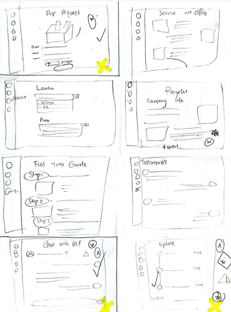
Alternative Design 2 – Aliff
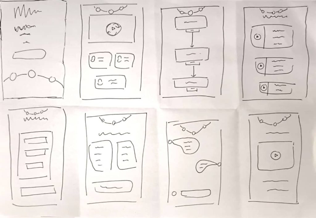
Alternative Design 3 – Nevi
Alternative Design 4 – Iman
Alternative Design 5 – Alia
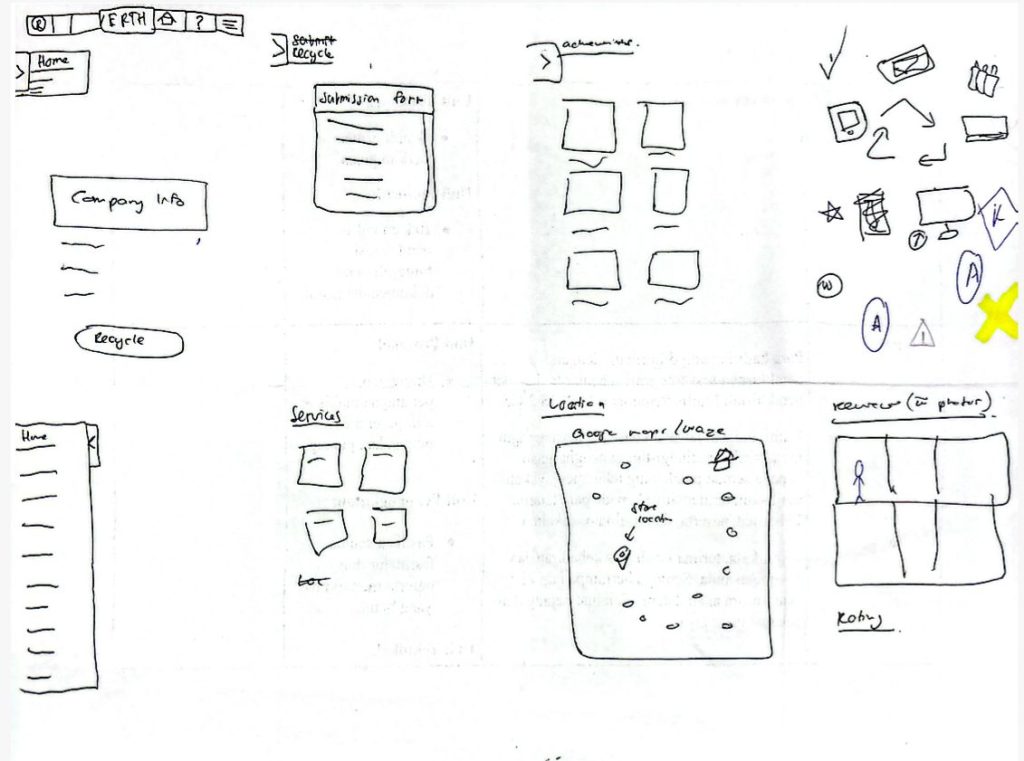
Voted Design
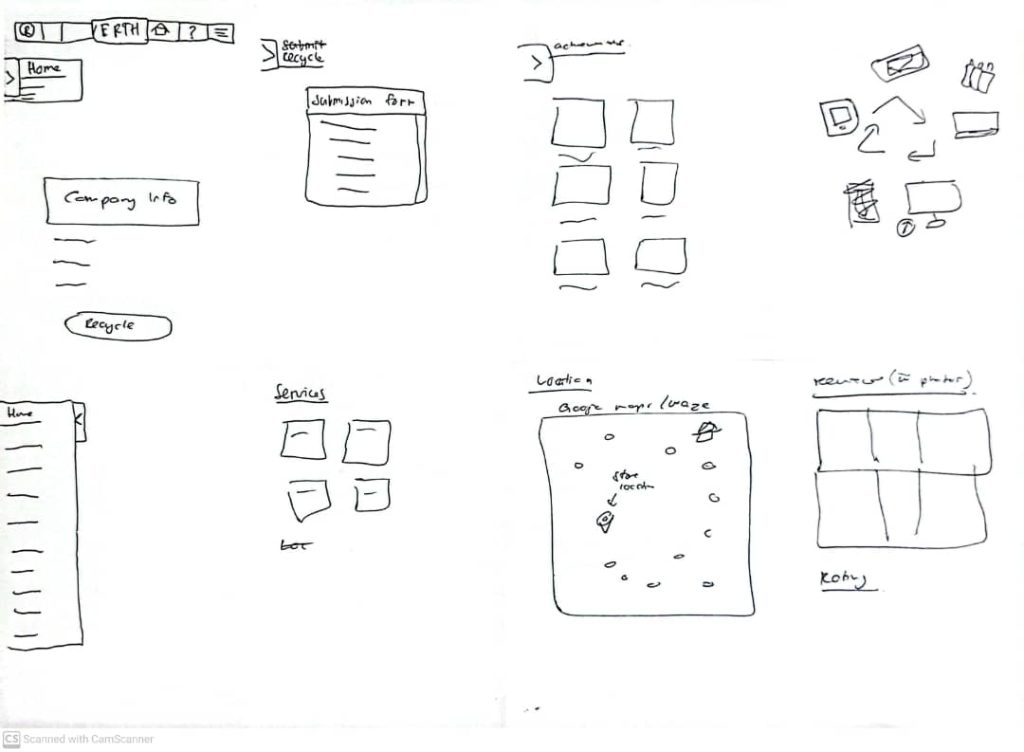
Wireframes
Task 1: Find the nearest certified e-waste drop off centers.
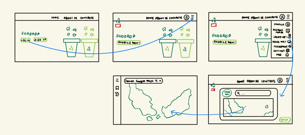
Shneiderman’s 8 Golden Rules
- Rule 1 : Strive for consistency – Every screen has the same top bar with Home, About Us, Contacts, and a user profile icon.
- Rule 2 : Seek for consistency – The design is simple and visual – suitable for a wide range of users, possibly including children or older adults.
- Rule 3 : Offer informative feedback – The RECYLCE NOW! button shows action can be taken.
- Rule 4 : Design dialog to yield course – Each user journey has clear beginning and end. The final screen includes a BACK button, offering closure and exit from the flow.
- Rule 5 : Prevent errors – The design avoids clutter and restricts choices through menus, reducing potential mistakes.
- Rule 6 : Permit easy reversal of actions – BACK button is clearly provide on the map interface, allowing the user to reverse navigation easily.
- Rule 7 : Support internal locus of control – User initiate navigation through menu selection (e.g., “LOCATE ME!”, “TRACK ME!”), supporting user-driven flow rather than system-driven.
- Rule 8 : Reduce short-term memory load – Menus are always available, and navigation is visual and spatial.
Task 2: Schedule home pickups for large or multiple e-waste items.
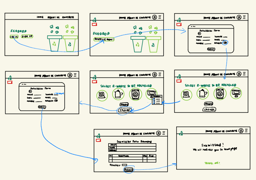
Shneiderman’s 8 Golden Rules
- Rule 1 : Strive for consistency – Navigation bar remains consistent across all screens: HOME, ABOUT US, CONTACTS, and profile icon.
- Rule 2 : Seek universal usability – Uses visual icons for e-waste items (laptop, kettle, etc) – great for all literacy levels. Simplified form design helps to fill in data easily. “Others” as flexible option – good for edge cases.
- Rule 3 : Offer informative feedback – After submission, a confirmation screen appears: “Submitted! We will redirect you to homepage.”. Each step progresses linearly with clear buttons like NEXT, DONE, SUBMIT.
- Rule 4 : Design dialog to yield closure – Each task has a clear start (form input) and end (confirmation screen).
- Rule 5 : Prevent erros – Drop-down menus and icons limit user input to valid options. Multi-step forms reduce information overload and the chance of mistakes.
- Rule 6 : Permit easy reversal of actions –
- Rule 7 : Support internal locus of control – User initiate actions themselves: LOG IN -> RECYCLE NOW -> SELECT DEVICES -> SUBMIT. Navigation menu and icons empower users to choose what to do next.
- Rule 8 : Reduce short-term memory load – Each screen shows only relevant info, minimizing overload. Device selection is visual and immediate – users don’t have to remember names. Summary form shows all entered data before final submission.
Task 3: Redeem points for discounts on tech repairs, e-vouchers, or donations to environmental NGOs.
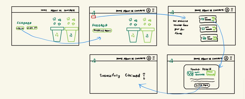
Shneiderman’s 8 Golden Rules
- Rule 1 : Strive for Consistency – Same layout across screens – navigation bar, buttons, and font styles remain consistent.
- Rule 2 : Seek universal usability – Simple icons and buttons like “CLAIM NOW” are easy for any user to understand.
- Rule 3 : Offer informative usability – The message “SUCCESSFULLY CLAIMED!” confirms completion of user action.
- Rule 4 : Design dialogs for closure – A clear beginning (voucher options) and end (confirmation screen) completes the task meaningfully.
- Rule 5 : Prevent errors – Users can only select one of the presented vouchers – no chance to input invalid data.
- Rule 6 : Permit easy reversal –
- Rule 7 : Support internal locus of control – Users actively choose when and what to claim – not automatic.
- Rule 8 : Reduce memory load – All voucher options are visible; users don’t need to recall anything from earlier screens.
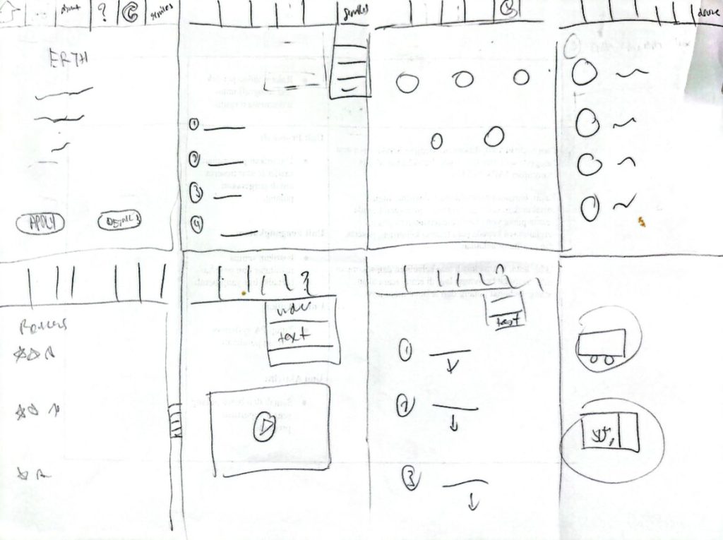
Interaction Metaphors

1) User Profile

2) Setting

3) Maps

4) Info

5) Pick Up

6) Search

7) Feedback

8) Fill Up Form