- INTRODUCTION
In this modern era, electronic waste (E-waste) has become a growing environmental concern, prompting initiatives like Electronic Recycling Through Heroes (ERTH) to promote about how to recycle electronic devices. While the intention behind ERTH is commendable, several usability and user experience issues have been identified that hinder the system’s overall effectiveness and accessibility.
The aims of this task analysis is to investigate and evaluate the core problems faced by users during using ERTH system. These include identifying barriers in navigation, clarity of content, ease of form completion, accessibility, and responsiveness. By breaking down the key tasks into detailed steps using Hierarchical Task Analysis (HTA), this study highlights specific pain points and proposes actionable improvements to enhance the overall user experience of the ERTH system.
- DERIVATION OF HTA
- HTA FOR TASK 1
User 1: Urban Household Residents
[Link Video User 1 doing Task 1]
[HTA for User 1 in textual presentation]
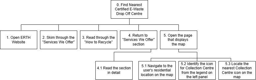
- Find Nearest Certified E-Waste Drop Off Centre
- Open ERTH Website
- Skim through the “Services We Offer”
- Read through the “How to Recycle”
- Return to “Services We Offer” section
4.1 Read the section in detail - Open the page that displays the map
5.1 Navigate to the user’s residential location on the map
5.2 Identify the icon representing a Collection Centre from the legend on the left panel
5.3 Locate the nearest Collection Centre icon on the ma
[HTA for User 1 in diagram presentation]
User 2: University Students
[Link Video User 2 doing Task 1]
[HTA for User 2 in textual presentation]
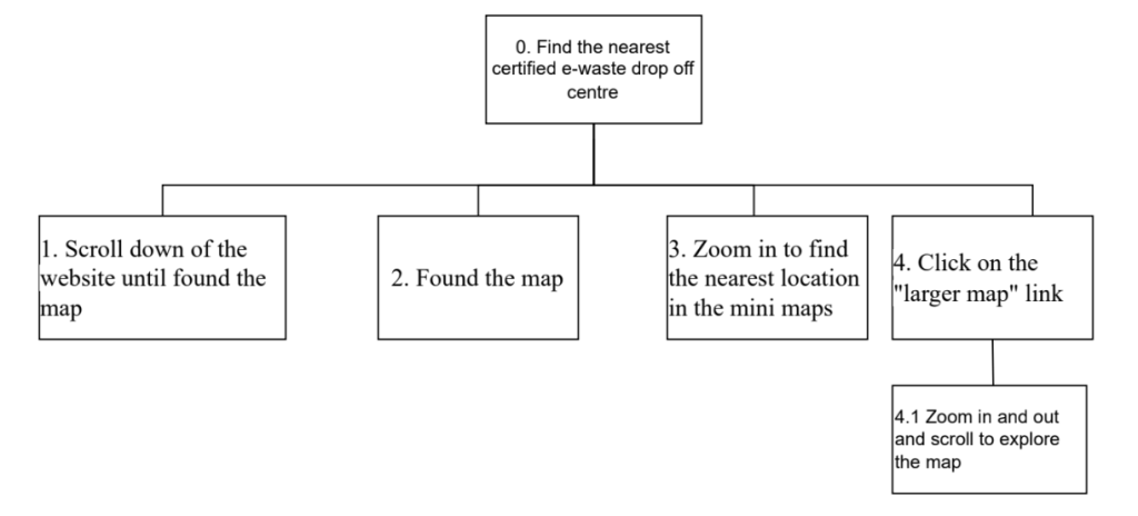
- Find the nearest certified e-waste drop off centre
- Scroll down of the website until found the map
- Found the map
- Zoom in to find the nearest location in the mini maps
- Click on the “larger map” link
- 4.1 Zoom in and out and scroll to explore the map
[HTA for User 2 in diagram presentation]
User 3: Small Business Owners
[Link Video User 3 doing Task 1]
[HTA for User 3 in textual presentation]
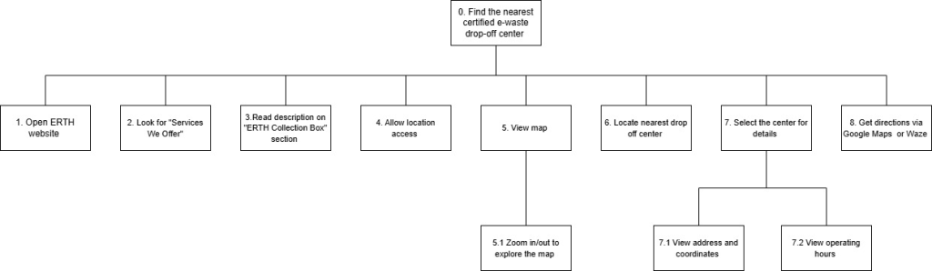
- Find the nearest certified e-waste drop off centre
- Open ERTH website
- Look for “Services We Offer”
- Read description on “ERTH Collection Box” section
- Allow location access
- View map
5.1 Zoom in/out to explore the map - Locate nearest drop off centre (based on distance and icons)
- Select the centre for details
- 7.1 View address, coordinates
- 7.2 View operating hours
- Get directions via Google Maps or Waze
[HTA for User 3 in diagram presentation]
- FINDINGS FROM THE HTA FOR TASK 1
For Task 1, The Hierarchical Task Analysis (HTA) was focused to how User fill in E-waste form at ERTH wesbite. This task was broken down into three several steps: Open ERTH website, Tapping Button Labeled “Yes, I want to Recycle!”, Fill in Users’ Details such as Whatsapp number, Name, Address, Email, Number of Devices. (User 1,2,3 behaviour observed from vid). Several usability issues were identified during the analysis. One key issue was the lack of clarity in the call-to-action (CTA) button. The label “Yes, I want to Recycle!” may not be immediately clear to all users about what will happen next, potentially causing hesitation or confusion. Additionally, the form was presented as a single long page, which can overwhelm users and increase the chances of missing fields, especially when scrolling is required to review or edit information.
Another major issue was the absence of real-time input validation. When users submit the form with incomplete or incorrect information, they are only alerted after submission, rather than being guided while filling out each field. This can lead to frustration and reduce overall efficiency. Furthermore, the website’s mobile responsiveness posed challenges, as form elements appeared cramped on smaller screens, making it difficult to interact with fields without zooming or excessive scrolling.
To address these problems, several improvements are recommended. The CTA button should be redesigned with a more direct label, such as “Start Recycling Now,” and supported with a short explanation of what to expect after clicking. The form itself should be divided into a multi-step format, separating sections like contact details, address, and device information, with a progress indicator to enhance navigation and reduce cognitive overload.
Implementing real-time input validation is also crucial to improve user experience. This can include visual cues such as red borders for errors or green checkmarks for correct entries. Finally, enhancing mobile responsiveness through the use of frameworks like Bootstrap or Tailwind CSS would ensure that the form remains user-friendly across all devices. These improvements can lead to a more intuitive and efficient form-filling experience on the ERTH website.
- HTA FOR TASK 2
User 1: Urban Household Residents
[Link Video User 1 doing Task 2]
[HTA for User 1 in textual presentation]
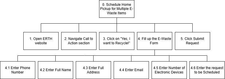
- Schedule Home Pickups for Multiple E-Waste Items
- Open ERTH website
- Navigate Call to Action section
- Click on “Yes, I want to Recycle!”
- Fill up the E-Waste Form
4.1 Enter Phone Number
4.2 Enter Full Name
4.3 Enter Full Address
4.4 Enter Email
4.5 Enter Number of Electronic Devices
4.6 Enter the request to be Scheduled - Click Submit Request
[HTA for User 1 in diagram presentation]
User 2: University Students
[Link Video User 2 doing Task 2]
[HTA for User 2 in textual presentation]
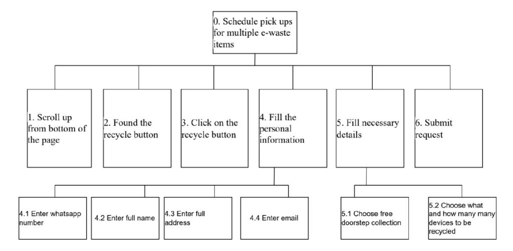
- Schedule pick ups for multiple e-waste items
- Scroll up from bottom of the page
- Found the recycle button
- Click on the recycle button
- Fill the personal information
- 4.1 Enter whatsapp number
- 4.2 Enter full name
- 4.3 Enter full address
- 4.4 Enter email
- Fill necessary details
- 5.1 Choose free doorstep collection
- 5.2 Choose what and how many many devices to be recycled
- Submit request
[HTA for User 2 in diagram presentation]
User 3: Small Business Owners
[Link Video User 3 doing Task 2]
[HTA for User 3 in textual presentation]
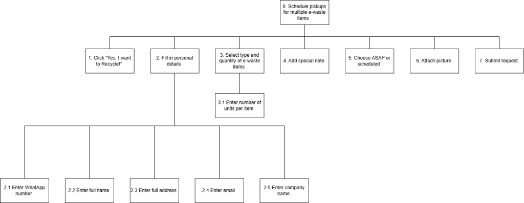
- Schedule pickups for multiple e-waste items
- Click “Yes, I want to Recycle!”
- Fill in personal details
- 2.1 Enter WhatsApp number
- 2.2 Enter full name
- 2.3 Enter full address
- 2.4 Enter email
- 2.5 Enter company name
- Select type and quantity of e-waste items
- Enter number of units per item
- Add special note
- Choose ASAP or scheduled
- Attach picture
- Submit request
[HTA for User 3 in diagram presentation]
- FINDINGS FROM THE HTA FOR TASK 2
For Task 2, users were asked to schedule a home pickup for large or multiple e-waste items. The core process involving the user to access the ERTH website, locating the form, filing in the required information and submit the request. While all users completed similar steps, the starting points and input details varied slightly across different type of users.
An observation has been made and all user has been faced with a different problem. For urban household resident, she followed a top-down approach, clicking on the main call-to-action (“Yes, I want to Recycle!”) and completing each form field in order. While university student navigates from the bottom of the page and had to scroll back up to find the button, showing less familiarity with the layout. And for the Small Business Owner, she provided more detailed input, including attaching images and selecting between immediate or scheduled pickup – indicating a more professional way. With the three of the observation, the issue that we can conclude was an inconsistent visibility of the CTA button depending on page scroll position or device, unclear input fields such as device quantity and device type, an overloaded form especially for casual users who may not understand which fields are required and a weak confirmation feedback after submission.
- HTA FOR TASK 3
User 1: Urban Household Residents
[Link Video User 1 doing Task 3]
[HTA for User 1 in textual presentation]
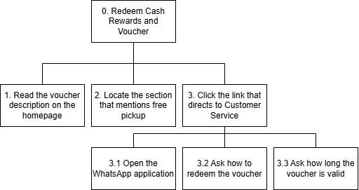
- Redeem Cash Rewards and Voucher
- Read the voucher description on the homepage
- Locate the section that mentions free pickup
- Click the link that directs to Customer Service
3.1 Open the WhatsApp application
3.2 Ask how to redeem the voucher
3.3 Ask how long the voucher is valid
[HTA for User 1 in diagram presentation]
User 2: University Students
[Link Video User 2 doing Task 3]
[HTA for User 2 in textual presentation]
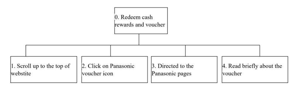
- Redeem cash rewards and voucher
- Scroll up to the top of webstite
- Click on Panasonic voucher icon
- Directed to the Panasonic pages
- Read briefly about the voucher
[HTA for User 2 in diagram presentation]
User 3: Small Business Owners
[Link Video User 3 doing Task 3]
[HTA for User 3 in textual presentation]
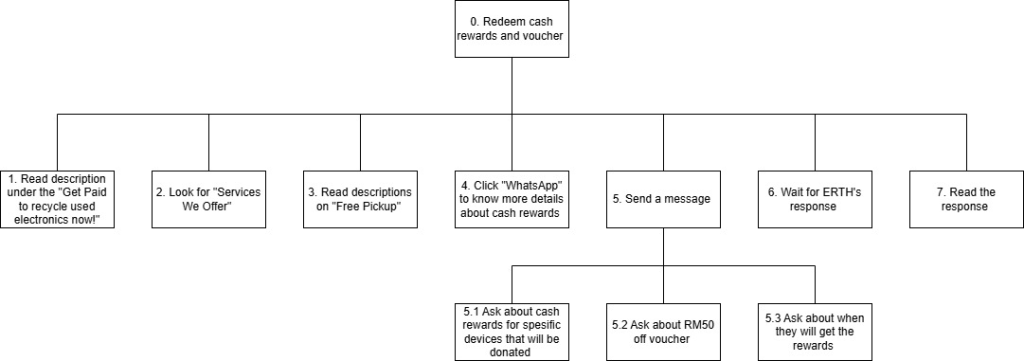
- Redeem cash rewards and voucher
- Read description under the “Get Paid to recycle used electronics now!”
- Look for “Services We Offer”
- Read description on “Free Pickup”
- Click the “WhatsApp” to know more details about cash rewards
- Send a message
5.1 Ask about cash rewards for specific devices that will be donated
5.2 Ask about RM50 off voucher
5.3 Ask about when they will get the rewards - Wait for ERTH’s response
- Read the response
[HTA for User 3 in diagram presentation]
- FINDINGS FROM THE HTA FOR TASK 3
For Task 3, users were tasked with redeeming rewards such as e-vouchers, tech repair discount, or donation option. The main steps include finding the rewards information, clicking on promotional banner or links, initiating contact, and asking for details about the redemption process.
From this observation, all of the user has a very different approach. For urban household resident, she followed the homepage description and contacted the support to inquired about redemption steps and voucher validity. University student clicked on visual voucher elements and briefly explored external promo pages but didn’t interact further. Small business owner actively browsed through multiple service and reward section, then massaged customer support with detailed and specific question on the e-vouchers. This observation has emerged several issues. The scattered reward information made it difficult to locate the option, external redirection broke the experience flow, lack of in-site instructions left users unsure on how to redeem and instructed communication with the customer services.
- DESIGN REQUIREMENTS
Based on the findings from the task analysis, several design requirements have been identified to enhance the usability and user experience of the ERTH website. These requirements aim to resolve key issues such as poor navigation, unclear user interface elements, limited mobile responsiveness, and lack of form feedback. The recommendations below serve as guidelines for redesigning or improving the current system.
- Clear and Intuitive Navigation Structure
The website should provide a well-organized navigation system with clearly labeled menu items such as “Recycle Now,” “Company Information,” “How It Works,” and “Drop-off Locations.” Important links should be accessible from the homepage with minimal scrolling or searching. A sticky navigation bar can also be implemented to help users easily explore other sections of the website without losing context.
- Improved Call-to-Action (CTA) Buttons
The call-to-action buttons such as “Yes, I want to Recycle!” should be revised with clearer and more direct labels like “Start Recycling Now” or “Book E-Waste Pickup.” These buttons should be visually prominent and placed in logical locations to guide users smoothly through the process. Brief descriptive text should accompany the button to clarify what the action entails.
- Step-by-Step Form Design
The current single-page form should be broken down into a multi-step form interface. This approach helps reduce cognitive overload and allows users to focus on one task at a time. A visual progress indicator should be included to inform users of their current position in the form and what steps remain. Each step can cover specific input categories such as contact information, pickup address, and device details.
- Real-Time Input Validation
Input validation must be implemented to assist users in correcting mistakes before form submission. Fields should display instant feedback through icons, colored borders, and tooltips. This immediate response helps users detect and correct errors on the spot, improving efficiency and satisfaction.
- Enhanced Mobile Responsiveness
The website must be optimized for mobile users by using responsive web design techniques. Layouts should adjust automatically based on screen size, with larger touch targets, readable font sizes, and collapsible sections to minimize scrolling. Frameworks such as Bootstrap or Tailwind CSS can be used to achieve a consistent and adaptive design.
- Consolidated Company Information Page
All essential company information should be grouped under a dedicated page labeled “About Us” or “Company Info.” This page should include sections such as service highlights, data protection policy, company achievements, testimonials, and contact options. The content should be structured using headers and icons to ensure easy scanning and readability.
- Accessible and Inclusive Design
The design must comply with basic accessibility standards. This includes using high-contrast text, alternative text for images, keyboard navigation support, and clear language. These features ensure that the website is usable by people with varying levels of ability.